We are extremely proud of all of our finishes, but it’s no secret that Antiqued Brass is our signature look. Though colour trends may come and go, we are confident our Brass will match any colour combination you want to throw at it, making it a lasting staple no matter your changing decor decisions. This sought after ‘living finish’ can elevate any room and we’d be hard pushed to find a paint colour it doesn’t look lovely with.
We are fortunate that there are so many excellent paint brands to help us discover new colour combinations for our rustic metallic lighting and homeware. Lately, deeper and more dramatic jewel hues are showing up throughout our customer homes, with an emphasis on neutrals and greens inspired by the natural world emerging in others. With more time spent indoors we’ve all been able to reflect on what we really want from our interiors, leading us to make choices we might have otherwise shied away from. Whether a blend of bold and energetic choices or more low key soothing tones, whatever you love we know our brass will be a great fit. We’ve collated some of our favourite customer homes with beautiful palettes, showcasing the best paint colours to complement their brass accents.
![]()
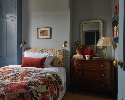
Divine bedroom detailing from @charlotteboundy featured in June’s @englishhomemag photographed by @james_mcdonald_photography. Here Charlotte has opted for Farrow & Ball’s Light Blue on the walls with the deeper De Nimes across the woodwork for a quietly elegant regency look. The Burnt orange soft furnishings against the powder blues create a rich but soothing tapestry of colour for this spare room: a truly idyllic backdrop for our Club Wall Lights.
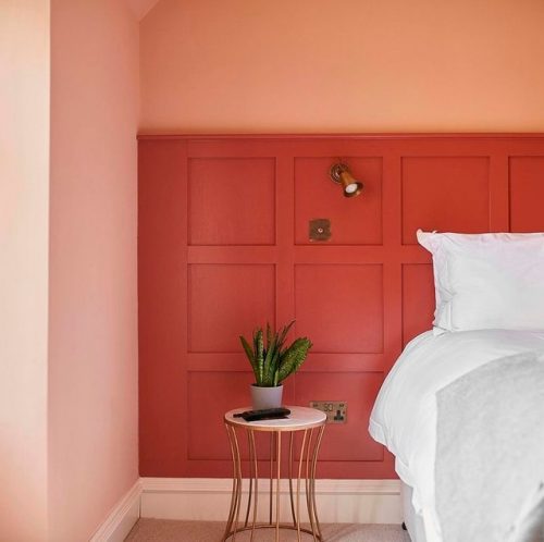
Matching the sockets, switch and a Single Curtis Wall Light for bedside task lighting is a winning trio in this room to remember from @ballintaggart at The Grandtully Hotel. Painted in the since archived Book Room Red, this stunning panneling gives the patina of our brass a beautiful blushing hue. Framed by the soft pink of Setting Plaster, this grown up pastel pink perfectly offsets the aged dusky red.
![]()
Everything in this bedroom from @gladyscottage compliments the item before and after it, creating a considered but organic homely country cottage feel that we could just sink right into. Our Hanson Wall Lights look gorgeous topped with a linen candle shade, matched to more rustic oatmeal colours throughout. Painted in Farrow & Ball’s Skimming Stone, this slightly warmer light grey is an elevated alternative to plain plaster, creating a clean slate and allowing for a pleasing jumble of patterns and texture. Look at our Waterford Cushion Covers and layer Limestone and Grey for a similar look.
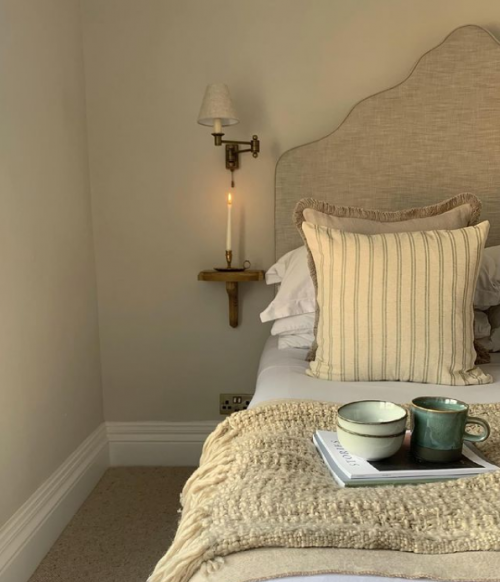
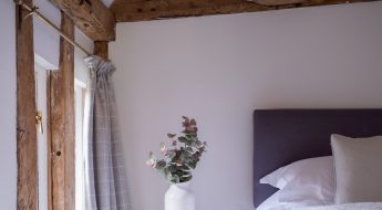
Our Lymington looks extremely elegant in this rustic french country style bedroom styled by @marthamiddleton. We already know that tactile linen and naturally aged brass is a match made in interior heaven, but we particularly love how the Half Shade blends into the wall here in our Natural Isabelle Linen, helping every little detail in the brass to stand out. This wall colour from Earthborn is Flutterby , described as ‘nearly white but not quite’, a pretty alternative to an earthy clay. A soothing feel radiates effortlessly from this room: exactly what you want for a laid back bedroom setting.
![]()
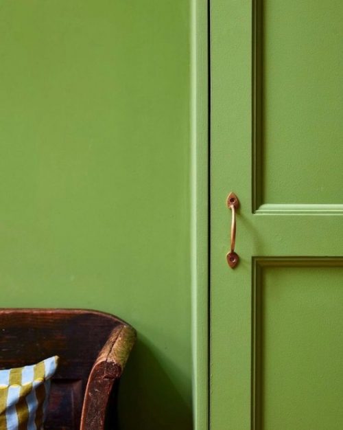
A gregarious green close up from @far.interiors painted in Invisible Green by Edward Bulmer. This grass green is inspired by the 19th century idea of painting ironwork in the landscape to ‘vanish’ it, truly bringing the outside in. The Victorians were particularly taken by shades of emerald like this, using dyes and paints made with arsenic to create similar vivid green hues. You certainly won’t find anything frightening in these beautiful colours from Edward Bulmer, who are utterly transparent in making eco-friendly paint. Doesn’t knowing this make the room feel even more lovely? Get the vintage look using distressed brass tones, adding warmth for that lovely lived in feel. Give your kitchen cabinets, cupboards and drawers an instant update with our handcrafted Gilby Drawer Pull: made with a quality you can appreciate with every touch.
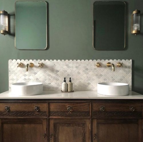
A wonderful option for those of you who prefer a more relaxed palette: Green Smoke by Farrow & Ball lends a dusky antiqued charm to this beautiful bathroom featuring our Cheltenham Wall Lights. A vintage vanity unit, scalloped tiles and beautiful brass detailing make for a showstopping space from designers @charnleyandcharnley. What’s not to love about burnished details against this weathered sage green?
![]()
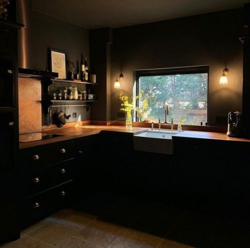
Off-Black by Farrow & Ball is the perfect choice in this striking kitchen from @warehouse_townhouse. Dark and brooding but softer than a too-intense true black, this colour really makes our brass sing. A stylish backdrop for a shaker kitchen that has an industrial edge, this room is proof that daring decor choices can really pay off. The lights featured are our Fisher Wall Lights, inviting a touch of elegant art deco design with its fluted glass shade.
Whatever your home style, we are confident you will find inspiration to pick up a paint brush and try something new. Opt for dynamic jewel tones for regency inspired period detailing, or go neutral for something a little more modern rustic. Moody dark rooms will always be favoured by some, naturally suiting those who sway towards industrial luxe. Our Antiqued Brass may be versatile enough for all of these looks, but one thing is consistent: we know how much you love it! As with things that take time and effort to make, they need to be cared for accordingly to ensure longevity. Find out more about how to care for and maintain your antiqued brass finish below.
![]()
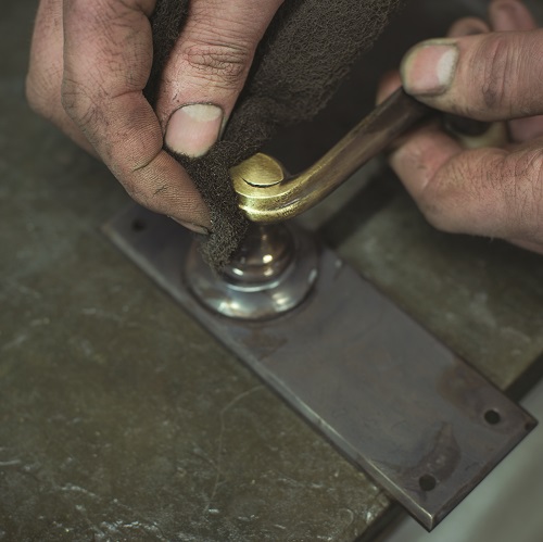
This is our most popular finish and deservedly so. We create the Antiqued Brass look by treating our solid brass with an antiquing solution. This solution simply speeds up the natural tarnishing process and means that you are able to take home an authentic aged brass product from day one that will only improve and darken over time.
In the trade this finish is often referred to as a ‘living’ finish because of the natural oxidisation process that occurs to the brass over time leaving it to dull down to an authentic antique look. This darkening and dulling is accelerated outdoors or in damp environments.
To clean the brass, we recommend using a small amount of soapy water and/or buffing it with beeswax or a good quality wax polish to help protect the finish. To remove smudges or finger marks, gently brush the entire surface of the product with a Scotch-Brite pad so there is an even tone over the whole surface. If you concentrate the brushing in one area, it may look patchy. Then buff with a soft cotton cloth.
If you are wishing to slow down the natural tarnishing process then we recommend regular polishing with a good quality brush and a soft cloth. One thing we do have to warn our customers about is that chemical polishes may strip away the original antiquing solution too so take care.
![]()
We know it is a tough decision deciding on which finish to go for, which is why you can request a free metal swatch of any of our finishes, not just Brass. Alternatively, our sales team not only see all the finishes on a daily basis but also are extremely knowledgeable on which ones work best in certain environments. So, please do not hesitate to give them a call on 01473 828176 or email us at sales@jim-lawrence.co.uk for any advice.
![]()
For even more home interior ideas, keep up to date by following us on Instagram, Pinterest and Facebook. Don’t forget to tag us in your home updates– we love seeing our products in their new homes.


Leave a Comment